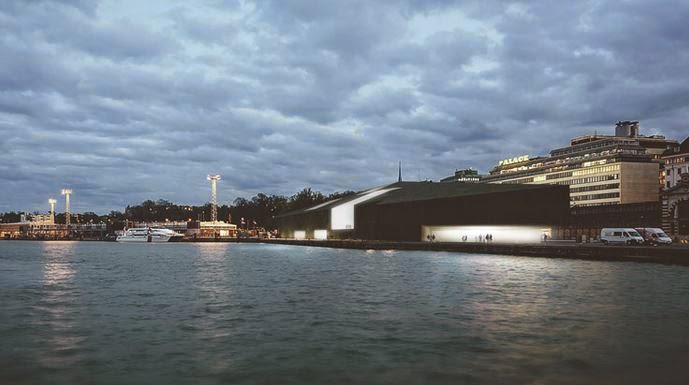
First up is what the designers call a "fragmental" design that
encourages people to flow within a new cultural core that is linked to the rest of the city, through the port promenade and the pedestrian footbridge to Tahtitorninvuori Park. This flexible access welcomes not only the visitors but also serves as a key cultural destination for the community. The museum skyline is composed by independent volumes highlighted by a landmark tower. These fragmental art exhibition spaces allow strong integration with outdoor display and event spaces, while the vertical sky galleries offer a new perspective over the city of Helsinki. This new museum concept together with the charred timber façade echoes the process of regeneration that occurs when forests burn and then grow back stronger.
This strange cross between a barn and a warehouse is supposed to be
two facilities that establish a dialog with each other – a museum made of two museums. The first museum is on the ground or tarmac level of the port facility. The existing terminal is re-used and re-appropriated for multiple activities. It is conceived as a public space, extending the pedestrian boardwalk into the building – a place for education and outreach within the city. The second museum is the museum as such, in so far as it houses exhibitions. The structure is in the air and hovers above the first. As a hall on stilts, partly removed from the everyday life below, the building offers a place of refuge, adhering to the notion of the museum as an “other space.”
Of this, the designers say (and no I didn't switch the text -- this is really what they say about this design)
Our proposal takes the form of a Helsinki city block rotated to the harbour front. Helsinki city blocks in the 1800s were named after wild animals. The proposed new block will have the tactile familiarity of a pet’s fur. Six timber-clad galleries are stacked over two levels and flanked by a seventh for administration and retail. Public spaces are formed between these and an intelligent textured glass skin wrapping the entirety to precisely diffuse light, translucent below, and transparent above.
I am still trying to decide if this is a serious entry or a joke -- it's so hard to tell with modernism:
Helsinki is a city of interiors. Due to its extreme climatic conditions, Helsinki’s civic society blossoms indoors. They form a robust network spaces that hosts and nurtures public life; interior public life.
31 Rooms, extends the network using the architectural technologies that construct Helsinki’s interior citizenry: i.e. walls, doors, windows, and the machinery that defines atmospheric conditions. While the new museum attaches to the network of existing conditions, leaves them undisturbed. . . .
31 Rooms is build using Finnish Cross Laminated Timber Pannels and Greenhouse like EFTE roofs. Since energy loss grows exponentially with temperature difference each room of 31 Rooms is acclimatized independent, forming a thermal onion that optimizes climate areas according to levels of access. Yet Each room’s final climatic conditions include certain degree of negotiation between the institution and its visitors.
31 Rooms questions the climatic conventions that mediate each of the artistic categories mentioned before, including the hygrometric chart to the tool box of curatorial strategies.
31 Rooms represent a new model within the global Guggenheim constellation, offering an opportunity for the foundation to develop a museum of the future with radical, multidisciplinary approaches to engaging new audiences with culture at large. The Guggenheim Helsinki will become a curatorial innovation reference centre for the other Guggenheim museums.
That first picture makes this design look like a stealth warship; the sketch above makes it look like a cubist slug. The designers say
We need a really radical change in how people use museums now. We propose a new Experience not only for the visitor, but for the Citizen. A critical shift from the idea of a building as a static object to a building that can accommodate the flux of daily life, the life of Street Art.With this in mind
We propose an Interior Street, an additional un-programmed space, which is not included in the original brief, that open the building up to citizen’s appropriation, and allow it to remain structurally relevant through the present and well into the future. The Interior Street, an Extra City Space, proposes a set of Unique Spaces that contains an almost unlimited number of conditions and situations that Public Space could offer to present, to study, (re) contextualize, or even provoke the people that enters it, whatever form it takes.Which is an interesting concept but who wants to hang out on a street that looks like a corridor in the hold of a stealth warship? And does this writer know that people have been calling for a radical change in museums for about, oh, 150 years? In the art world there is nothing more conventional than a call for radical change.
The creators of this brutalist thing speak of it as
Adorning the waters edge.Adorning? Adorning?
The sculptural form lends the Guggenheim a "Beacon-like" appearance, attracting visitors arriving by land or sea. A majestic public place in the city. The towers are gathered around a soaring catheral-like central space, providing a unique home for public events on the waterfront.Sigh. I vote for the first design, as being the least offensive. But once again I marvel that there is no architecture in my age that I really like. Not to mention that people can be taken seriously proposing museums with the tactile familiarity of a pet's fur, or that question the toolkit of energy saving architecture.
We need a radical departure for sure.


1 comment:
What complete stinkers! You'd think with half a dozen designs, each from a different architect, you'd get something appealing, but they're all just absolutely awful!
Post a Comment